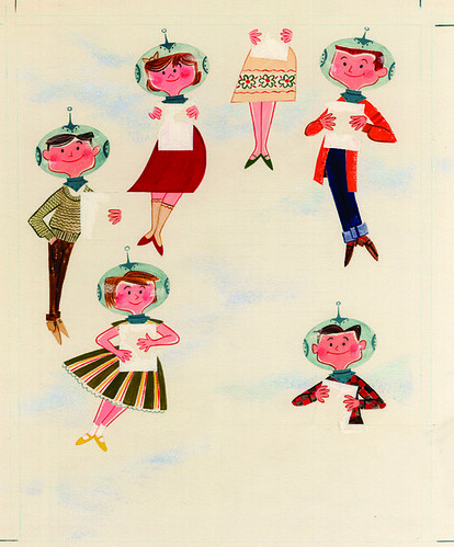
Today let's revel in some original illustrations created in the late 1950s by a handful of artists for Walt Disney Magazine. Inspired by the immense popularity of the Mickey Mouse Club television program, this high-quality periodical for kids featured stories about young studio stars, as well as articles touching on science, music and the interesting world around us.

Best of all is the sophisticated art direction lavished upon each issue by staff artist Paul Hartley. An accomplished illustrator himself, Hartley is revered today for having designed the look of Walt Disney's Cold War-era classic, Our Friend the Atom, as well as several of the original silk-screened attraction posters for Disneyland.
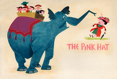
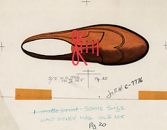
Here's a comical painting by Hartley for a story called The Pink Hat published in the August 1957 issue. (Click small images to view at larger sizes on Flickr.)
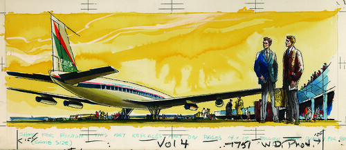
Legendary Disneyland designer Herb Ryman created this modern airport scene for a "Spin and Marty" adventure in 1959.
Al Dempster, a golden boy of Little Golden Books, painted this fantastic depiction of Johnny Appleseed for the series "Heroes of American Folklore" in 1957.
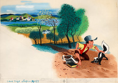
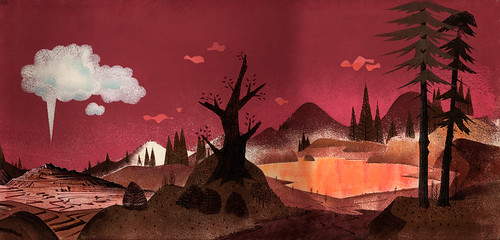
The uncredited title illustration for "Yellowstone: Land of Burning Mountains" published in June 1957, may have been the work of writer Milt Banta, who was also an artist. Banta died at a very young age, at 36, in late 1959.
Can't get enough of this good stuff?




14 comments:
Gosh - I love those space people! Wish I could draw like that.
Matt, If anyone could, YOU could!
Great stuff, Kevin! Thanks for sharing.
Nice stuff! Thanks for posting!
Fantastic examples!
Really wonderful, so clear and simple, yet so much fun to look at.
Thanks for posting such great artwork!!!
Oooooooo..."Spin and Marty"....LOVED that show! Perkins was my fave.
I happily stumbled upon this blog- it makes me smile! Thanks!
Cool illustrations. Love that style. Bring back Walt Disney Magazine! ;)
Hey Kevin,
Keep up the great work! We all owe Stacia Martin a big hug. When time permits give me a quick e-mail at matt@cworks.org. We have a linkedin group I think you might want to join.
how many Matt's can comment on this post? At least 4 :) I LOVE this mid-century style, especially fond of the space helmets - very Jetsons.
Kevin,
I think I have a drawing done by Paul Hartley in th early 50's early 60's. Its abot 10' x 20'. So its pretty big. Done in oil paint on a canvas. Can you help me identify it?
If you can help let me know where to send the pictures (email address)
Kevin I am Paul Hartley's daughter. Send me a photo and I'll see if I can help!
stupedna@gmail.com
Post a Comment