Friday, December 26, 2014

Christmas with Old Friends


My favorite project this year was creating the corporate holiday greeting card for Warner Bros. Studios Animation.  Warners currently owns the Hanna-Barbera film catalog and I was beyond thrilled when they asked me for an original design featuring the classic H-B characters. 


There are so many good characters to choose from so, naturally, I chose the earliest ones and placed the style in the late '50s/early '60s.  Ruff and Reddy, Huckleberry Hound, Yogi, and Boo-Boo Bear are constructing a paper tableau using the very tools I used to create the actual scene. 


On the flip-side, Quick Draw McGraw and his sidekick Baba Louie are assisting from behind the scenes.


This was so much fun to work on, and required some tricky staging to pull off the illusion that the flimsy paper characters were actually supporting the scissors and x-acto knife.


The interior of the card had its own special tableau, as well.  I thought it could be fun to contrast large and small characters together in one shot:


Magilla Gorilla dangles a real vintage ornament (from our own Christmas tree at home) while the mice Pixie and Dixie leap around.  Incidentally, I hope everyone out there reading this is familiar with all these great Hanna-Barbera characters.  We don't see them very much today—except perhaps for Yogi Bear—which is quite a shame.  I spent countless hours of my kidhood enjoying the TV antics of these characters, and it was a dream come true to be able to revisit with them for a short while as they skipped across my workbench.

Monday, November 24, 2014

Monday, October 13, 2014

Tiki Kiliki


A gift for a sweet and photogenic friend, Tiki Kiliki (Miss Christie White) of The Hukilau
(Painting by Jody Daily, tiki mug by Kevin Kidney.)

Tiki Kiliki, herself.


Tuesday, September 02, 2014

Rolly Crump: The Architect of Delight

Illustration for Los Angeles Magazine by Kevin Kidney & Jody Daily,  March 2011

Rolly Crump is one of our favorite designers in the whole wide world. Whether we're talking about his theme park contributions for Disney, or his satyrical counter-culture posters, Rolly rules.

A few years ago Los Angeles Magazine asked us to create an illustration to accompany an article about the legendary artist, and of course we were thrilled.  Our first rough concept was heavily inspired by our love for Rolly's "Museum of the Weird":

Our first concept.  Too weird?

Rolly's bizarre bats and dragons proved to be a little too dark for the tastes of the magazine's art director, who asked us to try something lighter and more cheerful. We decided to take elements from some of Rolly's more familiar Disneyland designs and build an imaginary theme park out of them.  We lovingly referred to this concept as "Crump City":

"Crump City" preliminary sketch
 The art director liked it, and decided we should do sort of a mock "attraction poster" with the elements.  The design became more and more simple as our "poster" took shape.  We created our art digitally in Adobe Illustrator and played around with possible color schemes.

Experimenting with different colors and values.

We did a lot of fussing with colors until we landed on the final bright purple version at the top of this post.  Everyone seemed to like it, and we even received a swell compliment from Rolly himself.  Score!

Tuesday, August 26, 2014

Rolly Crump: Muse of the Weird and Wonderful

Sun illustration by Rolly Crump, 1966

Rolly Crump is one of my favorite artists in the whole world—not only for his groundbreaking Disney work—but for his quirky and beautiful independent art as well.   Actually, I'm inspired by everything I've ever seen him do.

Rolly with his Tower of the Four Winds model
for the 1964 New York World's Fair

In Disney circles he is known for his designs on the Enchanted Tiki Room, It's a Small World,  the Haunted Mansion, the Adventureland Bazaar, and to a lesser degree for his legendary unbuilt Museum of the Weird—macabre and witty concepts that were decades ahead of their time and Tim Burton.

Lighting Fixture for The Museum of the Weird, 1966

I love his drawing style of the 1960s: bold, ragged ink line, textured and angular, with colors kept to a minimum. Much of it borders on the psychedelic.  Even more, his art has a sly sense of humor that I'm simply crazy about.

Pride Creations "Push Down" Toys, 
concepted by Rolly, 1960s 
According to Rolly, even while at Disney he always had cool projects going on the side.
In 1960, a chance meeting with West Coast rock poster pioneer, Howard Morseburg, led to a new venture in printmaking. Rolly's satirical designs poked fun at Beatnik culture, the coffee houses and jazz clubs of Greenwich Village, Seattle, San Francisco, and the East Bay. 

Poster for Pete's Poop Deck Jazz Club
Seattle, Washington, 1960
His easy-to-read graphics satirized big issues of the era, from drug use to the human rights record of revolutionary Cuba and the Soviet Union.  Though they apparently weren't made in extremely large quantities, the hand-pulled prints were popular with artistic young musicians and hipsters, and were influential on poster design that later dominated the Sixties.

"Green Gasser Kauphy House" Poster 1960
In 1959 Rolly became a show designer at WED (now Walt Disney Imagineering) after Walt saw some of the propellers and mobiles he had created.  
Rolly's Rongo Tiki God concept, 1962

Jody and I first met Rolly when we were curating "Tiki: Native Drums in the Orange Grove" at the Anaheim Museum in 1996.  Rolly gave a 2-hour presentation describing the inspiration for his Tiki designs and his other work.  It was an unforgettable evening.

Jody Daily, Rolly Crump, & Kevin Kidney
Anaheim Museum Tiki Show, September 14, 1996

In our own projects for Disney, Jody and I have welcomed the opportunity to more fully geek out over Rolly's designs by translating several into merchandise, including his 1967 Tomorrowland Ticket Booth Small World Clock facade, and, of course, his Tiki characters.

New Disneyland Tiki Room Rongo Bowl
Rongo Tiki Drink Bowl at Disneyland, 2009

Thanks, Rolly, for sharing your creativity and utter coolness with us.

Monday, August 11, 2014

Paper Boy


"I'm a bow-legged chicken, I'm a knock-kneed hen,
Never been so happy since I don't know when,
I walk with a wiggle and a giggle and a squawk
Doin' the Tennessee Wig-walk."


Saturday, July 05, 2014

Grand and Glorious "America On Parade" Models


Four paper people in rectangular frames, looking like minimalistic strangers on a train, could be something you'd expect to see in a museum of modern art. But this small three-dimensional model made of cardboard, white paper, and plastic toothpaste caps is actually a piece of rough concept art created for one of Disneyland's most famous parades.

"Television and Movies"
America On Parade ran daily at both Disneyland and Walt Disney World during the 1975-76 US bicentennial anniversary. Consisting of fifty units and 150 performers, it was by far the most elaborate parade ever staged at the Disney parks.

Here are some very rare images—most of them shot by myself in the late 1980s using a Polaroid instant camera—of the wonderful scale models that Disneyland kept in storage at the time. Back then, the Disneyland Entertainment-Art Department preserved a treasure trove of artwork for Park shows going all the way back to the early sixties and Walt's lifetime. When I was just starting out as a young parade designer at Disney, I became fascinated by these fragile hand-made miniatures and assembled a file of snapshots for my own personal reference.  Around 1999, shortly after I had transferred out of the department to a new position in Glendale,  I learned to my horror that nearly all of the Anaheim model shop's archive had been destroyed or discarded in order to "free up precious storage space for other things." I've come to believe many of the photos I had taken might now be the only existing record of this (mostly vague) corner of Disneyland history.

"Thanksgiving Turkey"

"Betsy Ross"
The A.O.P models were made in 1974 by Clare Graham and a small team of artists under the creative direction of Bob Jani, who had also led the creation of the Main Street Electrical Parade. Built from simple materials, such as colored felt, paper, wire, and illustration board, these models guided the construction of the final full-sized parade floats.

The Transcontinental Railroad
I love these, and refer back to them often.  The stylization was a great inspiration to us in designing the "paper sculpture" look for Mickey's Soundsational Parade.  The model, above, of the two steam locomotives coming face to face at the completion of the first transcontinental railroad is one of my all-time favorites. It's a stunning unit, and I just wish the image were sharper.

"Schoolhouse"
"Wagons West"
"Industrial Revolution"
"Phonograph"
"Radio"
Some of the models from the section of the parade dedicated to "America's favorite pastimes"…playing sports and eating ice cream.  Some high-concept ideas here!

"Popular Sports"
"Ice Cream"
"Telephone"
The Capitol
Transportation
These "transportation" floats, depicting the 19th and 20th centuries are pretty fantastic, as well.  Some of the models shown here were photographed for a 1975 souvenir book (by David Jacobs) sold during the parade's run, but most historic Disneyland parade art is unpublished, lost, and unknown.   I'll try to share more photos in the coming months, even the out-of-focus ones!  

Tuesday, June 17, 2014

Another One That Got Away: The "20,000 Leagues Under The Sea" Master-Folio

"Giant squid astern, sir!"
I've got a whale of a tale to tell you, lads.  Another title for our proposed Walt Disney Master-Folio series would have been 20,000 Leagues Under The Sea, the epic 1954 Disney adaptation of Jules Verne's classic science fiction novel.  The film is a favorite of ours, and three years prior, we had designed the 50th anniversary collectibles assortment for Disney, (including the most faithful replica of the submarine Nautilus ever mass-produced.)

Here were some of the riches we aimed to include:

In the years since we put together this proposal, the soundtrack recording was eventually released, first on iTunes and later as a CD by Intrada (which you can purchase today! ) We had long been pushing for the recording's release, and the Master-Folio package seemed like one more good reason to pester Disney about it again.

Serious "Leagues" fans will have noted that the Image Album was to include stills from the lost "South Pole scene" not in the final motion picture:


And there was more.


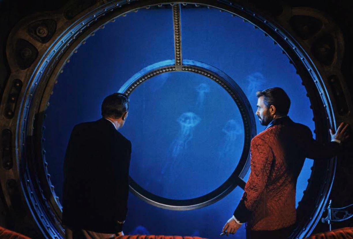
And one of the most exciting elements of all: a flip book of the unused pencil animation done early in the film's production--for the Giant Squid!  In the finished movie, an enormous articulated puppet attacked Captain Nemo's submarine and fed our collective childhood nightmares, but did you know the monster was first planned to be flat cel animation combined with live action?


The "squid animation" was an exciting discovery for us in Disney's Animation Research Library, with 115 graphite drawings on long CinemaScope paper. It amounted to only a few seconds of animation on screen, but it was dramatic to see, with the tentacled monster abruptly rearing backward in a blast of black ink.  Sorry I'm unable to show it to you here, because the sequence remains in Disney's hands. Hopefully someday it will surface!  In the meantime, you can see some of the other animated sea life that would have been spied through Nemo's wondrous irising window—here: on youtube.


Will the Walt Disney Master-Folio Collection someday come to pass?  Maybe, as James Mason's Captain Nemo says, "In God's good time."